Personas.
Empathizing with user goals and pain points.
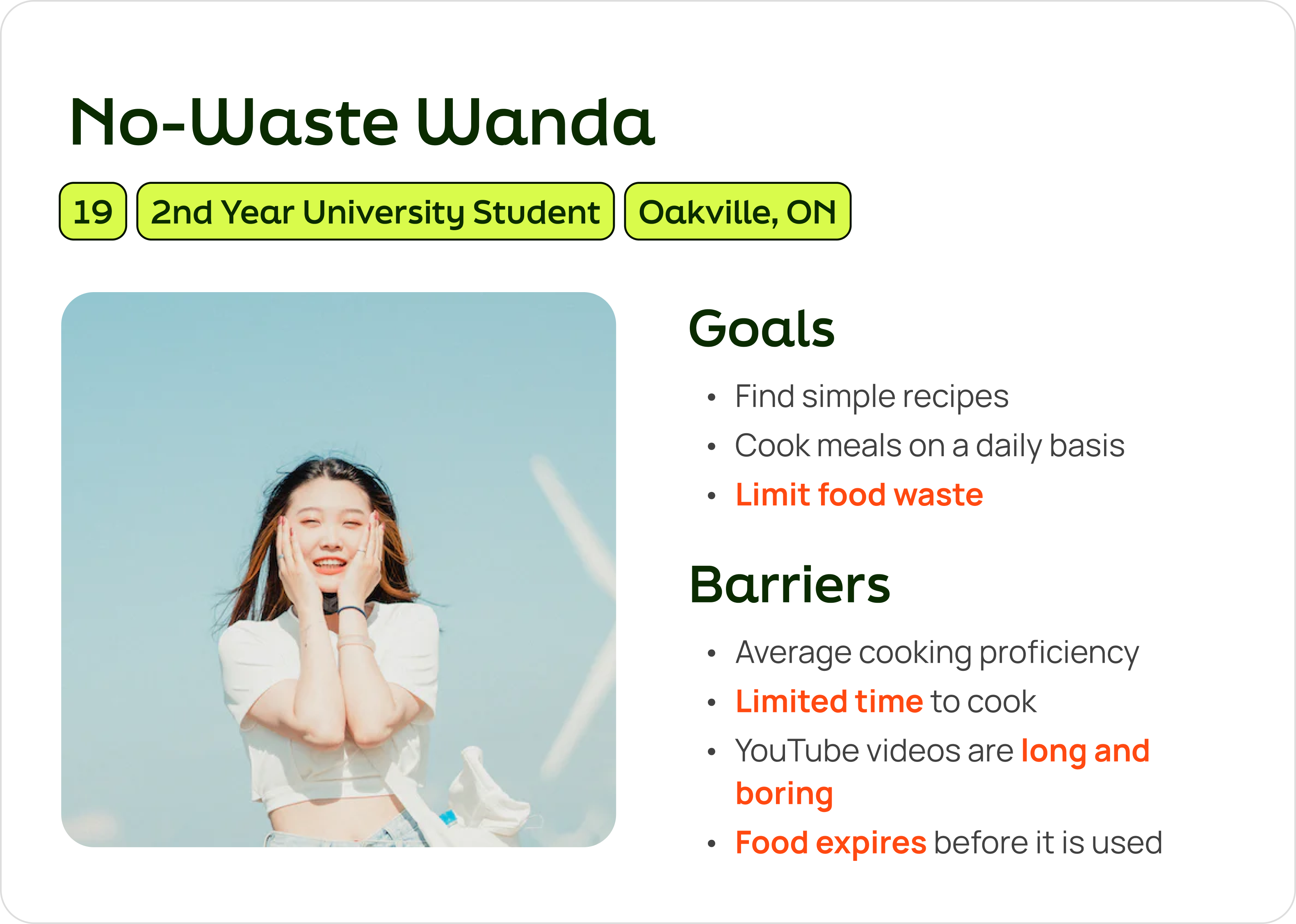
Focusing on young adults in post-secondary school helped to paint a better picture of the target audience. I created two personas to understand the different types of people that would use my product.
DESIGN GOALS.
Combating barriers to cooking.
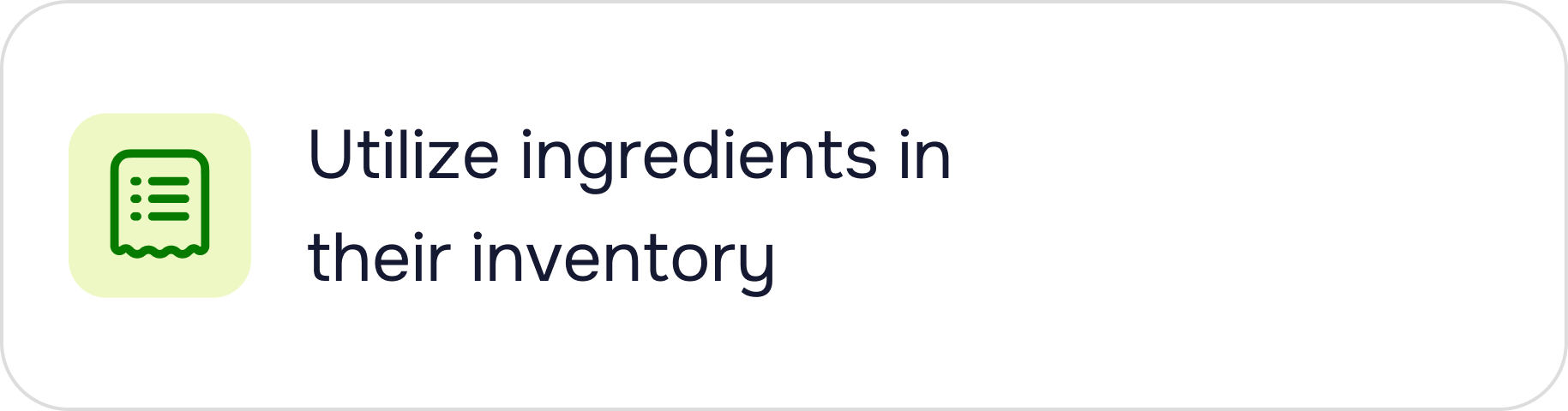
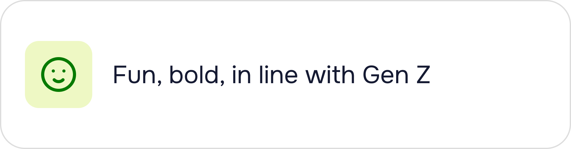
To help young adults like Wanda and Aidan, the solution must offer quick recipes using current ingredients to reduce waste, simple tutorials for beginners, and a fun, bold Gen Z vibe to inspire cooking.
Ideate.
During ideation, I prioritized features, established an MVP, evaluated the landscape of cooking apps, and began designing flows.
PRIORITIZATION.
I ranked 9 features based on user importance, project goals, and feasibility.
When survey participants provided feedback on desired features for a cooking app, I compiled their responses and had interviewees rank them in order of importance. Using these rankings, I created an ‘Importance x Feasibility’ chart to identify features that are both highly important to users and feasible to design and implement technologically.

Early Iterations.
Creating a high-level basic task flow.
Early on in the design process, I mocked up a few low-fidelity wireframes to get a sense of the flow a returning user would take when entering the app. It was difficult to imagine fun visuals and interactions in this stage, which made it challenging to make concrete decisions.

Competitive Analysis.
Evaluating the landscape of 5 cooking apps.
Although many of the apps I tried were of high-quality, I identified a few opportunities for my own product to include that would set it apart from the others. Using feedback from my primary research, I was able to validate these opportunities.

Prototype & Test.
Once the main flow was established, I worked on the visual design and enhanced the interaction design after user testing.
Visual Design.
Creating a sassy, bold, and fun design system.
From ‘YesChef’ to ‘YaasChef’, a name change suggested by my supervisor meant more than just a simple alteration. This change led to an entire rebrand in vision and tone. Initially, I had used more pale colours that were not as popular amongst Generation Z. The push to use bolder colours was inspired by the name change as well as the interest that young adults have in bolder colours. I created the design system with reusable components, colours, typography, and visual assets.


.png)


.png)


